
FREE MODERN CV TEMPLATE FOR WORD
Download an editable modern CV template for Microsoft Word with a contemporary two-column design, clear visual hierarchy and space for your experience, skills and professional strengths without turning the document into a graphic-heavy résumé.
Microsoft Word (.docx) • Contemporary two-column design • Editable • No account required
What Actually Makes a CV Look Modern?
A modern CV does not need unusual fonts, large graphics or several bright colours. A contemporary appearance usually comes from how information is organised and prioritised.
- clear separation between sections;
- strong contrast between headings and body text;
- controlled use of colour;
- consistent alignment;
- useful white space;
- shorter blocks of text;
- information grouped according to importance;
- a design that still allows the reader to find job titles, dates and achievements quickly.
The purpose of a modern design is to guide attention. If the visual treatment makes the reader work harder to understand your career, it has gone too far.
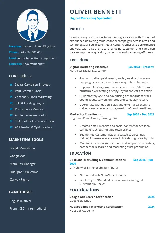
Modern CV Template Preview
The preview below shows the same digital marketing CV included in the downloadable Microsoft Word file.
Template Details
File: Microsoft Word (.docx)
Layout: Two columns
Photo: Yes
Example: Digital Marketing Specialist
Style: Contemporary with accent colour
Account required: No
The Design Should Tell the Reader Where to Look First
One of the most useful differences between a modern CV and a plain document is stronger visual hierarchy.
When someone opens the CV, the design should make it easy to identify:
- your name and professional direction;
- your current or most relevant role;
- important achievements;
- role-specific skills;
- dates and employers;
- education and relevant professional information.
Not every item should compete for equal attention. The strongest information should be visually easier to find than supporting detail.
Why This Template Uses Two Columns
The two-column structure separates supporting information from the main career narrative.
Main Column
- professional profile;
- work experience;
- achievements;
- education;
- career evidence that needs explanation.
Sidebar
- contact details;
- core skills;
- software;
- languages;
- certifications;
- other information that can be understood quickly.
The sidebar is most useful for information that does not need long explanations. Avoid moving important career achievements into a narrow column simply because there is space available.
How the Modern CV Example Works
The downloadable template uses a digital marketing example because the combination of measurable performance, digital tools and cross-functional work fits naturally with a contemporary presentation.
Professional Profile
Commercially focused digital marketing professional with six years of experience delivering multi-channel campaigns across retail and technology sectors. Skilled in campaign planning, performance analysis and content optimisation, with experience using data to improve customer acquisition and marketing efficiency.
The profile provides context, while the visual design leaves the employment history as the main evidence.
Recent Experience
Digital Marketing Executive
Northstar Digital Ltd | London
2022–Present
- Plan and deliver digital campaigns across paid search, email and social media channels.
- Analyse campaign performance and prepare monthly reports for marketing and commercial teams.
- Improved landing-page conversion rate by 18% through content, layout and call-to-action testing.
- Coordinate with design, sales and external suppliers to deliver campaigns against agreed deadlines.
The result is specific enough to demonstrate capability without relying on the visual design to make the candidate appear stronger than the evidence supports.
A Modern CV Still Needs Strong Content
Modern design can make strong information easier to notice, but it cannot replace strong information.
Compare:
Responsible for digital marketing and social media.
with:
Planned paid search, email and social campaigns and improved landing-page conversion by 18% through content and call-to-action testing.
The second version would remain stronger even in a plain black-and-white document. The design should support the evidence rather than compensate for vague writing.
When Does a Modern CV Make More Sense?
A contemporary design can be particularly useful when the way information is presented contributes naturally to the type of role or employer you are targeting.
Digital and Marketing Roles
A modern format can suit roles involving digital channels, campaigns, content, brand work or online customer journeys, especially when the design remains controlled and professional.
Technology and Product Roles
A clear contemporary structure can work well when skills, tools and project experience need to be visible without overwhelming the employment history.
Commercial and Business Development Roles
Strong hierarchy can help separate sales achievements, account responsibilities and commercial skills from supporting information.
Creative Roles
A modern CV may help establish visual judgement, but the CV does not need to become a substitute for a portfolio. Use a portfolio link when the work itself needs to be seen.
When Might a Simpler CV Be the Better Choice?
More visual design is not automatically better for every application.
- the employer specifically requests a plain CV;
- you are applying through a recruitment system and want to minimise layout complexity;
- the role is highly traditional and visual presentation adds little;
- your career history is extensive and needs more continuous text space;
- you expect to edit the document frequently and want the easiest possible structure to maintain;
- the design starts taking space away from important experience.
For a more restrained alternative, see the simple CV template. If online recruitment-system compatibility is your primary concern, use the ATS-friendly CV template.
Use Colour as Navigation, Not Decoration
Accent colour can help establish hierarchy when it is used consistently.
Good places for restrained colour may include:
- section headings;
- the sidebar;
- small divider elements;
- your name or professional title;
- subtle emphasis within the layout.
Avoid introducing several unrelated colours or using colour as the only way important information is distinguished. The document should still make sense if printed in greyscale.
Be Selective With the Sidebar
A sidebar makes supporting information compact, but it can quickly become crowded.
Useful Sidebar Content
- a small number of role-specific skills;
- software genuinely relevant to the vacancy;
- languages when useful;
- professional certifications;
- contact information;
- a portfolio or professional profile link where relevant.
Avoid Turning It Into a Storage Area
- every software package you have ever used;
- long lists of generic soft skills;
- skill percentages without a meaningful basis;
- old certifications with no relevance;
- large blocks of descriptive text.
The sidebar should make the main column easier to read, not compete with it.
What About the Photo?
This particular template includes a photo area because the design supports one. That does not mean you must include a photograph in every application.
Whether a photo is appropriate can depend on the country, industry and employer. If you do not want to use one, remove the image area rather than leaving a placeholder.
We also provide a dedicated CV template without a photo when that format is available on the site.
Avoid the “Designed CV” Trap
It is easy to keep adding elements because Microsoft Word allows you to change shapes, icons, colours and text boxes.
Stop before the layout starts working against the content.
- Do not add charts simply because the page has empty space.
- Do not turn skills into decorative graphs that communicate less than plain text.
- Do not use multiple font families to make sections look different.
- Do not make headings so large that they consume useful space.
- Do not place important achievements inside narrow decorative boxes.
- Do not make contact details difficult to locate for the sake of symmetry.
Good modern design should make the CV feel simpler to navigate, not more complicated.
Modern CV vs Professional CV
Modern CV
- stronger visual identity;
- more visible use of colour;
- contemporary two-column structure;
- useful for digital, marketing, technology and commercial applications;
- requires more care when editing the design.
Professional CV
- more restrained business identity;
- greater emphasis on career progression and professional credibility;
- well suited to management, operations, finance and corporate roles;
- less dependent on contemporary visual styling.
Modern CV vs Simple CV
Both aim to make information easy to understand, but they use different levels of visual design.
Choose Modern When…
- a contemporary presentation supports the intended impression;
- you want stronger visual separation between information types;
- you are comfortable maintaining a more designed Word layout;
- your sidebar information is genuinely useful.
Choose Simple When…
- you want the least visual complexity;
- your career history should dominate the page;
- you expect to update the CV regularly;
- you prefer a straightforward one-column reading path.
Editing a Designed CV in Word Without Breaking the Layout
A modern template usually contains more layout relationships than a plain one-column document. Replacing a short example with a much longer paragraph can therefore affect nearby sections.
- Download the DOCX file and keep an untouched backup copy.
- Replace the example name and contact information first.
- Change the professional profile while keeping it reasonably concise.
- Replace employment entries one at a time.
- Check the page after each major section instead of waiting until the entire CV is finished.
- Keep the existing heading hierarchy unless you have a reason to change it.
- Replace sidebar skills rather than continually adding more rows.
- Remove optional sections that you do not need.
- If you remove the photo, check that the surrounding content remains aligned.
- Avoid changing several font sizes independently.
- Check whether longer job titles or employer names have wrapped awkwardly.
- Keep a master Word copy before exporting the final application version.
If the document moves while editing, see our guide to editing a CV template in Microsoft Word.
Common Modern CV Mistakes
- Adding design without hierarchy. More colour does not automatically make important information easier to find.
- Overfilling the sidebar. Supporting information should remain compact.
- Using charts for ordinary skills. Clear text is often more informative.
- Making the design the main attraction. Your professional evidence still needs to carry the application.
- Using too many colours. Keep accents consistent.
- Forcing every section into the original template. Remove what you do not need.
- Ignoring the target employer. A visually stronger CV is not necessarily the right choice for every organisation.
- Changing the design for every application. Tailor the content first; redesign only when there is a clear reason.
- Assuming modern means ATS-friendly. Visual appearance and recruitment-system compatibility are different questions.
Download the Modern CV Template for Word
Download the editable modern Word CV shown above and replace the example digital marketing content with your own experience, achievements, skills and qualifications.
Microsoft Word (.docx) • Editable modern CV • No account required
Modern CV FAQs
Does a modern CV need colour?
No. Contemporary design is more about hierarchy, spacing and structure than colour alone. Colour can be used as a restrained accent when it improves navigation or visual identity.
Is a two-column CV more modern?
Two columns can create a contemporary appearance and help separate supporting information from career history, but a modern CV does not have to use columns. The structure should suit the content and application.
Can I use this template without a photo?
Yes. Remove the photo area if you do not want to use one and check the surrounding spacing after editing the Word document.
Are modern CVs only for creative jobs?
No. A restrained contemporary layout can work across digital, marketing, technology, sales, project and other professional roles. Highly creative styling is a separate choice and is not necessary simply because a CV is modern.
Is a modern CV better than a professional CV?
Neither is automatically better. The modern template places more emphasis on contemporary visual presentation, while the professional template places more emphasis on business-style presentation, professional scope and career progression.
Is this modern CV guaranteed to work with every ATS?
No. More designed layouts can introduce additional complexity, and no CV template can guarantee compatibility with every applicant tracking system. Use the ATS-friendly CV template when structural simplicity for online applications is the main priority.
Should I keep a second, simpler version of my CV?
It can be useful when you apply through different channels. For example, you may prefer a more visually designed version when sharing directly with a person or alongside a portfolio, while using a simpler version for applications where document parsing is a concern.
Related Word CV Templates
Professional CV Template
A polished business-style Word CV focused on professional scope, achievements and career progression.
Simple CV Template
A restrained one-column format focused on straightforward reading and easy editing.
ATS-Friendly CV Template
A deliberately simplified format for applications where reducing structural complexity is the main concern.